|
6 CHARACTERISTICS OF AN IKONIC LOGO
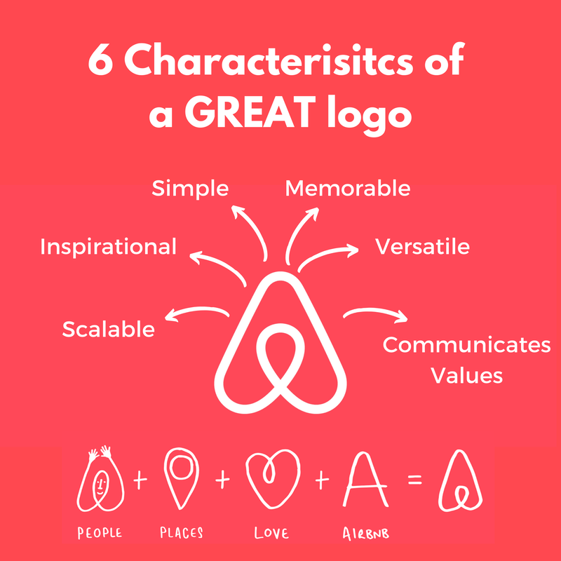
𝗔𝗶𝗿𝗯𝗻𝗯’𝘀 𝗹𝗼𝗴𝗼 𝗶𝘀 𝗺𝘆 𝗙𝗔𝗩𝗢𝗥𝗜𝗧𝗘 𝗹𝗼𝗴 𝗶𝗻 𝘁𝗵𝗲 𝘄𝗵𝗼𝗹𝗲 𝘄𝗶𝗱𝗲 𝘄𝗼𝗿𝗹𝗱, 𝗶𝘁 𝗶𝘀 𝘁𝗵𝗲 𝗱𝗲𝗳𝗶𝗻𝗶𝘁𝗶𝗼𝗻 𝗼𝗳 𝗮𝗻 𝗜𝗸𝗼𝗻𝗶𝗰 𝗟𝗼𝗴𝗼. 𝗜𝘁’𝘀 𝗯𝗮𝘀𝗶𝗰𝗮𝗹𝗹𝘆 𝗹𝗼𝗴𝗼 𝗽𝗲𝗿𝗳𝗲𝗰𝘁𝗶𝗼𝗻. 𝗟𝗲𝘁’𝘀 𝘁𝗮𝗹𝗸 𝗮𝗯𝗼𝘂𝘁 𝘄𝗵𝘆 𝘁𝗵𝗶𝘀 𝗶𝘀 𝘁𝗵𝗲 𝗰𝗮𝘀𝗲. There are 6 logo characteristics you must pay attention to have a logo that powerfully represents your company, stands out, creates community, builds loyalty, and creates clients. In other words, an Ikonic logo. You want an Ikonic logo? Listen up -this is our 6-step test to creating an Ikonic logo. 𝟭. 𝗖𝗼𝗺𝗺𝘂𝗻𝗶𝗰𝗮𝘁𝗲𝘀 𝘃𝗮𝗹𝘂𝗲𝘀 & 𝗯𝘂𝗶𝗹𝗱𝘀 𝗰𝗼𝗺𝗺𝘂𝗻𝗶𝘁𝘆 - The airbnb logo is absolutely incredible at communicating their values and their purpose through just a symbol. Their logo is sooo thoughtful, integrating their purpose (places + people) with love, which is a core value of their. It also stylistically looks like an A for airbnb. It gets an absolute A+++ on communicating so much through a simple, elegant symbol…which brings us to simplicity. 𝟮. 𝗦𝗶𝗺𝗽𝗹𝗲 - an Ikonic logo by necessity is simple. You know those logos that are not simple, the ones that have way too many colors, are doing way too many things, there’s like an eagle, with a river, and people holding hands, and there’s a heart, and they have multiple colors, and holy smokes!! That’s just NOT how you do an Ikonic logo. An Ikonic logo is simple, yet powerful. It’s one well throughout symbol, often a symbol that incorporates different components of a company’s values, purpose, vision, and are all communicated in just ONE symbol. There’s two ways you can do this- graphically (airbnb) or through words (Coca Cola). I’m a big fan of imagery that communicates the many pieces of your brand in just one symbol (airbnb). 𝟯. 𝗜𝗻𝘀𝗽𝗶𝗿𝗮𝘁𝗶𝗼𝗻𝗮𝗹 - the colors, the lines, whether rigid, soft, fluid, sharp, all need to communicate the company’s vision, and inspire people to want to be part of the movement. 𝟰. 𝗠𝗲𝗺𝗼𝗿𝗮𝗯𝗹𝗲 - going back to simplicity, part of the reason you want your logo to be simple (think Nike) is so it will be memorable no matter where it is seen. A super complicated logo will just by its nature be less memorable since it add friction to memorability through complexity, and this means it will be harder for people to create a connection with your brand. 𝟱. 𝗩𝗲𝗿𝘀𝗮𝘁𝗶𝗹𝗲 - your logo needs to be versatile. It needs to be able to be presented in different colors, and through different mediums, and always work. Does your logo work if it’s a dark background, white background, does it fit on a sticker, on a shirt, tote bag, or is it crazy long and so complicated to fit in diverse environments? 𝟲. 𝗦𝗰𝗮𝗹𝗮𝗯𝗹𝗲 - finally, you need your logo to be scalable. This means whether we are seeing it on a billboard on the highway, or a tiny little graphic (say your profile pic on instagram) your logo must work given different size uses for your logo. How does your logo do on the 6-part test? Are you 6 for 6? 4 out 6? 2 out of 6? No logo? Do you need some help in creating an ikonic logo and an ikonic brand? Let’s chat.
0 Comments
|


 RSS Feed